In this workshop, you will develop the ability to identify the educational significance of statistics and to interpret and apply useful statistics for the classroom. The accompanying video will review statistical concepts and calculations.
This lesson will introduce the following measures of central tendency (the center points of data) and variability (the diversity of the data).
One of the most useful statistics for teachers is the center point of the data. Knowing the center point answers such questions as, “what is the middle score?” or “which student attained the average score?” There are three fundamental statistics that measure the central tendency of data: the mode, median, and mean. All three provide insights into “the center” of a distribution of data points. These measures of central tendency are defined differently because they each describe the data in a different manner and will often reflect a different number. Each of these statistics can be a good measure of central tendency in certain situations and an inappropriate measure in other scenarios. The next section describes each statistic and both its educational value and its limitations.
The mode is defined as the most frequently occurring score. If the data are arranged in a frequency distribution similar to illustration 4, then the mode is easy to identify. In illustration 4 the mode is 89. Why is the mode 89? Because there were four students who scored an 89, and that was the largest number of students who scored at the same level on this assessment.
The mode is easy to locate on any type of distribution curve graph, regardless of skewing. Let’s examine several examples to further understand the concept of mode by locating it on three representative types of graphs.
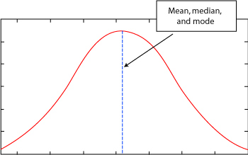
From Illustration 7: Mode of a Normal Curve
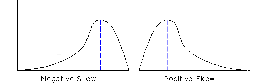
From Illustration 8: Mode of Skewed Graphs
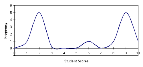
Let’s complicate the process by looking at the data collected from an elementary class where 14 students were given the same 10 point quiz. The frequency distribution for the class is listed in Illustration 9.
Illustration 9: Elementary Class Frequency Distribution
| Student Score | Frequency |
|---|---|
| 10 | 1 |
| 9 | 5 |
| 8 | 1 |
| 6 | 1 |
| 2 | 5 |
| 1 | 1 |
Notice that the frequency distribution only lists those scores that were actually attained by students, not all the possible scores. What is the mode for illustration 9?
If you selected 9 you are correct; if you selected 2 you are also correct. This is a trick question because the data displays two modes: both 9 and 2 are correct. However, it would be more correct to describe the data as a “bimodal distribution of data.” Bimodal simply means that there are two modes within the same distribution of data. In this case, because the modes are considerably far apart, the elementary teacher likely has a class where a substantial number of the students understand the content and a substantial number of students who do not. However, if in the same bimodal scenario, one mode was a score of 10 and a second mode was a score of 9, then the teacher would be entitled to a victory lap around the school parking lot.
A bimodal graph is easy to identify. In every case, there will be two peaks in the data. The two peaks represent the frequency that students attained those scores. Illustration 10 is a graph of the data displayed in illustration 9. Note the two humps in the graph representing a bimodal distribution of the data.
Illustration 10: Bimodal Distribution
The determination of the mode is a useful statistic for teachers. It not only measures the central tendency or grouping of data, but it also provides a reference point to assist teachers in understanding the nature of the students and their needs, and then guides teachers in planning instruction that will meet their needs.
The median divides a distribution exactly in half so that 50% of the scores are at or below the median and 50% of the scores are at or above it. It is the “middle value” in a frequency distribution. When the number of data points is an odd number, the middle score is the median. For example, given 13 scores, the 7th score would be the median. When the number of data points is even, like 14, then the median is equal to the sum of the two middle scores in a frequency distribution divided by 2.
Illustration 11: Ordered Array of Unit Exam Scores (Odd number of scores)
| Student Score |
|---|
| 50 |
| 49 |
| 46 |
| 41 |
| 34 |
| 31 |
| 29 |
| 29 |
| 29 |
| 27 |
| 24 |
| 19 |
| 12 |
| 12 |
| 7 |
Consider the following scores collected from a unit exam worth 50 points in a class of 15 students.
Whenever dealing with an odd number, the median is the middle number. So in Illustration 11, the total number of student scores is 15, an odd number. The midpoint of 15 is the 8th score because there are 7 scores above it and 7 scores below it. The teacher then counts down or up to the 8th score to determine the midpoint, or median. In the case of Illustration 11, the median is 29. Note that, for this data set, 29 is also the mode.
What if this teacher had a class with an even number of students? How would the median be calculated? Illustration 12 provides an example of how to determine the median in an even numbered class. Let’s assume that the class size is 6 and they have just completed an exam worth 50 points. The following illustration displays their scores.
Illustration 12: Ordered Array of Unit Exam Scores (Even number of scores)
| Student Score |
|---|
| 3 |
| 6 |
| 12 |
| 19 |
| 35 |
| 47 |
To determine the median of an even number of scores, we begin by adding the 2 middle numbers and dividing by 2. In this case, the numbers 12 and 19 are the middle numbers. Together they total 31. The quotient of dividing 31 by 2 delivers a median of 15.5. Note that the median does not have to represent one of the listed scores. For a teacher using an ordered array of test scores, the median locates the middle or center grade.
On a display of the normal curve the median is exactly the midpoint of the data distribution and is located in the exact center of the graph. This is also the highest point on the curve.
Would the median be affected by a skewed data distribution? Since the median represents the midpoint, skewed data would move the midpoint in the direction of the bulk of the scores. Illustration 13 displays how the median is influenced by a positively or negatively skewed data distribution.
Illustration 13: Median Location with Skewed Data
The mean is the arithmetic average of all of the data points. It is also the most common measure of central tendency and is the most widely understood. In fact, when most people think of average, they are imagining the mean. The mean is easy to calculate and most people have been doing it since elementary school. To calculate the mean, add up all of the data points and divide that result by the total number of data points. Consider the following ordered array of test scores on a 25 point quiz from a typical middle school class of 20 students.
Illustration 14: Ordered Array of Students’ Quiz Scores
| Student Score |
|---|
| 25 |
| 25 |
| 25 |
| 24 |
| 23 |
| 23 |
| 21 |
| 21 |
| 20 |
| 17 |
| 17 |
| 15 |
| 14 |
| 14 |
| 12 |
| 9 |
| 9 |
| 6 |
| 5 |
| 5 |
There are 20 scores listed in the ordered array. Note that they do not have to be organized in an ordered array to calculate the mean.
The sum of these scores is 320. To calculate the mean, divide the total of the scores (320) by the number of scores (20): 320/20 = 16. Observe that the mean score does not have to be represented by any of the actual scores as no student scored a 16 on this assessment.
For the teacher, it is helpful to calculate the mean to get a sense of the average score. However, the mean has a major drawback: it is greatly influenced by extreme scores. Consider the data below in illustration 16. Assume the data points are from a single student on a series of 10 point tests.
Illustration 15: Student X’s Quiz Scores
| Student Score |
|---|
| 10 |
| 10 |
| 10 |
From the data, it is easy to calculate that the student’s mean is 10. This student undoubtedly deserves one of the top grades in class. But let’s imagine that the child leaves on vacation and misses school for a week. On the next exam, the student scores a 2, so the new data looks like the following:
Illustration 16: Student X’s Updated Quiz Scores
| Student Score |
|---|
| 10 |
| 10 |
| 10 |
| 2 |
From this data the new mean is 8. An 8 is a considerable drop from the previous mean of 10. In this case, the child has scored the highest possible grade three times and a low grade only once. However, the extremeness of the low grade has a dramatic effect on the mean, which reduced the child’s average by 20%.
Let’s get an idea of how many 10’s the student would have to get to move the mean back up to a 10. To keep the calculations simple, let’s try adding 6 more scores.
Illustration 17: Student X’s 10 Quiz Scores
| Student Score |
|---|
| 10 |
| 10 |
| 10 |
| 2 |
| 10 |
| 10 |
| 10 |
| 10 |
| 10 |
| 10 |
The total number of scores is 10 and the sum of the numbers is 92. Therefore, the mean is 9.2. How might this affect the child? One score out of ten was enough to keep the child from regaining a mean score of 10. In fact, the child could never get an average of 10 because there is no way to recoup the mathematical effects of the low score. The mean has limitations as a statistic and this is a classic example of the most common one. This is a teacher’s dilemma: what score does the student deserve? It is important for teachers to remember that the mean is strongly influenced by extreme scores. At this point it may by useful for the teacher to reference the median and mode for additional support.
Using the mean as the sole source of information for determining a student’s grade may be unfair to a student if the student’s scores contain an extremely low score. Instead, it may be a good idea to drop the score or minimize the weight of the score. It is unwise to drop an extreme score if it is unusually high.
Some school districts may have a policy stating that a teacher cannot fail a student by recording a score lower than a certain grade, like 40% for example. This is to help avoid situations where a student can never bring up their scores. When grades are deflated to a hopelessly low number, this can have very negative effects on classroom behavior and participation.
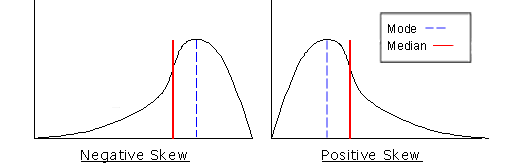
The way that extreme scores affect the mean is apparent in illustration 18. The mean is identified in a positively and negatively skewed data distribution as it generally relates to both the mode and the median.
Illustration 18: Mean Values of Skewed Data
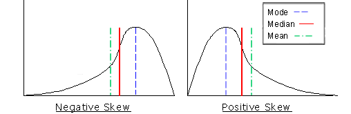
Like the median, in a positively skewed frequency distribution, the mean moves to the right and the majority of the scores fall below the mean. For a frequency distribution that is negatively skewed, the mean moves to the left and is shaped so that the majority of its scores fall above its mean.
For a teacher, the use of the mean may be inappropriate. In the case where the bulk of scores are located in one mode, and a minimum number of scores are a significant distance from the mode, the mean average may create an arithmetic model that does not approximate the nature of the students. Likewise, the mean of a bimodal distribution may not describe anything useful to the teacher.
The mode, median, and mean are measures of central tendency and they provide meaningful information to the teacher when used correctly. Each of the statistics is a good measure of central tendency in certain situations and a bad measure in others. So what are their limitations, and when should a teacher use a particular statistic? Here are some helpful tips:
So which statistic should the wise teacher use? The best answer is to use the one(s) that are appropriate for that purpose. Often it depends upon what the teacher wants to know. When in doubt, use all three before making a major decision.
Measures of central tendency provide the teacher with a mathematical description of how well the students are performing. However, it should be noted that two completely different sets of data, such as the results of two different tests in elementary social studies, can have the same mode, median, and mean, but have vastly different scores. For a better understanding of this phenomenon, it is necessary to understand the basics of variability, which we will look at next.
The mode, median, and mean define the centers of a distribution of scores and provide the teacher with important information, but they do not present the total picture. For a view of the entire process, an understanding of variability must be applied to the measures of central tendency. As an example, consider illustration 19.
Illustration 19: Limits of Central Tendency
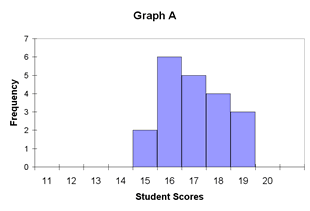 |
 |
| Mean = 17 | Mean = 17 |
| Median = 17 | Median = 17 |
| Mode = 16 | Mode = 16 |
The distributions of data displayed in illustration 19 have the same measures of central tendency. The mode, median, and mean of Graph A are identical to the mode, median, and mean of Graph B. So as far as central tendency is concerned, they are equal. However, in educational terms, they are anything but equal. For a teacher, graphs of this nature represent two very different circumstances.
Let’s consider that both graphs represent the test scores of two different sets of students in the same subject area on the same day. Graph A shows a tight band of scores near the midpoint. Graph B shows a more diverse range of scores. Translated, the students in Group A have performed at about the same level of average understanding. However, the students represented by Graph B displayed a much more diverse level of understanding. In this case, some of the students performed quite well, while others scored considerably less well. If the same teacher had both sets of students, this would likely indicate the need for two different lesson plans for each class.
By looking at variability we can access a more complete story than what the measures of central tendency have told us about students’ scores.
Standard deviation is a measure of the spread of scores around the mean in a normal curve. It is sometimes referred to as the mean of the mean. For a given situation, the standard deviation measures how close the data points are to the mean. If most of the data points are clustered around the mean, then the standard deviation is small. Conversely, if most of the data points are widely spread and are not grouped around the mean, then the standard deviation is large. In other words, the more the data points differ from the mean, the greater the standard deviation, and vice-versa. Remember, data points for a teacher are likely to be test scores.
To clarify the concept of standard deviation, let’s consider a class of 30 students. Each of the 30 students received a score of 87 on a test. Since every student received the same grade, the mean is 87. Since all of the scores are the mean, there is no arithmetic difference between the scores and the mean. Therefore, the standard deviation in this scenario would be zero. If a few students scored an 85, the standard deviation would not be zero, but it would be quite small and much less than one.
The focus here is on standard deviation rather than variance, because although the two are related (the standard deviation is the square root of the variance), the standard deviation is easier to interpret because it is expressed in the same units as the data, e.g. points on a test. The standard deviation is usually denoted with the letter σ, whereas the variance is σ2.
The calculation of standard deviation is quite simple, but there are two slightly different ways to do it depending on the context. First, consider the steps below:
This method is appropriate when the data represents the entire population of interest. What is much more commom however, is that the data being analyzed are a sample taken from a larger population. In this case, the biased standard deviation will be too small compared to the expected but unknown standard deviation of the population. Therefore, we need a way to calculate an unbiased standard deviation. Fortunately this is simple, as shown in Step 5. Instead of dividing by the total number of scores, divide by the total number of scores minus 1. If you are unsure whether to use the biased or unbiased standard deviation, use the unbiased (number of scores minus 1) calculation.
Let’s work an actual problem. In a class of 4 students, the following scores were recorded:
| Student Score |
|---|
| 9 |
| 8 |
| 4 |
| 3 |
It is a general rule of thumb for statisticians that a large standard deviation means an excessive spread of data well dispersed away from the mean. A small standard deviation indicates a tight cluster of data points near the mean.
Probably the most valuable information regarding standard deviation is gained by analyzing the application of standard deviation to the normal curve. When the normal curve is divided according to standard deviations, the result is displayed in illustration 20.
Illustration 20: Standard Deviation
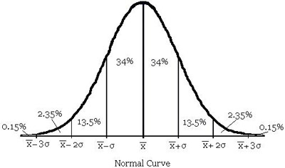
So why is it important to know about standard deviations and the normal curve? Consider a situation where a teacher gives a 100 point test. When the data were analyzed, the mean score was 70 and the standard deviation was 5. If we assume that the distribution of scores is normal, resulting in a normal curve, then we can conclude:
This data can be transferred to a data table for easier analysis:
Illustration 21: Distribution of Scores from 100 Point Test
| Interval of Scores | Percent of Scores |
|---|---|
| 65-75 | 68% |
| 60-80 | 95% |
| 55-85 | 99.7% |
From this table a teacher can get a much clearer picture of how well the students performed on a particular assessment. In the scenario presented, the standard deviation was quite small. Let’s look at the same situation, except this time the standard deviation will be 10.
It is easy to see that the standard deviation on this set of scores indicates that the students have a wider range of understanding as measured by this assessment. Imagine if the standard deviation was 20 instead of 10!
An understanding of standard deviation is advantageous when analyzing the scores and data from another source, such as a vendor attempting to sell the teacher a new product.
In the next lesson, we will continue our discussion of statistics with a look at correlations.
Many schools and school districts are attempting to be more “data driven,” or to make more decisions based on their schools’ data. (Visit resources from the Center for Public Education for more information about what types of data are used).