In this workshop, you will develop the ability to identify the educational significance of statistics and to interpret and apply useful statistics for the classroom. The accompanying video will review statistical concepts and calculations.
This lesson introduces simple statistical knowledge for everyday use and the necessary mathematical explanations related to:
As a student, I remember being very eager to receive my test results to find out how I did and to compare my scores with my classmates. During the moments right before tests were returned you could feel the anxiety in the classroom. Then, the release of this data was usually accompanied with groans of despair, sighs of relief, and cheers of joy. Good students always made certain that the other students knew how well they had scored; embarrassed students were silent; really bad students made fun of their failing grade. It was usually my hope that my score would be one of the best in the class. When I was worried about my score or I had not given my best effort, I hoped that the teacher would grade on a curve so that my score might receive the benefit of the extra points. I liked teachers who graded on a curve.
When I became a teacher, I provided statistical evidence as a way of showing my students the fruits of their labor. Interestingly, the same groans of despair, sighs of relief, and cheers of joy were evident in my own classroom. Some things never change.
At first I provided the statistics because I thought it was a fun and useful thing to do for the students. I soon realized that there was a greater value to these statistics that I had overlooked for a number of years. I found that if I analyzed the statistical data carefully, I could infer a number of things about the quality of the test, the capabilities of the students, and the overall fairness of the assessment. As I began to look more closely at the data that I had collected, I also began to discover shocking truths about myself as a teacher. I found myself asking important questions like: Why did most of the students miss a particular question? Did I not teach it well enough? Was the test a valid measure of what I thought I was testing? Is it possible that I constructed a test that was confusing or biased? Did I score it correctly? Was the score that the students received an accurate measure of their achievement? These questions and many more flooded through my thoughts as I peered into the world of statistics and applied that knowledge to my teaching.
Along with the curriculum, lesson planning, and assessments, statistical analysis is another integral part of teaching. Statistical analyses of assessment data provides information that links assessments with lesson planning and instruction. Teachers use statistical information to guide lesson planning, create quantified student achievement profiles, provide accurate communication to students, parents, and other teachers, identify a starting location for instruction, and define remediation. It is also used to gain insights for refining instruction for students, small groups, or the whole class level and to indicate ways to improve the overall efficiency and efficacy of teaching and learning in the classroom. When teachers neglect to perform statistical analysis on their assessments, they miss a significant opportunity for valuable feedback. On the other hand, a misused statistic or a poor interpretation of a good statistic limits or prohibits classroom productivity.
In this workshop we will focus on a few statistical calculations and data displays that teachers can use to make the most of their data, starting with some simple tools that you may have already used throughout various experiences.
There are some statistics that every teacher will find useful. Although it is not always necessary to know the mathematical derivation of statistics, it is important to understand the data they produce. It is equally as important to know the limitations of statistics and what they cannot produce. After all, statistics does have a reputation for being a tool that can “spin” data to show preferred outcomes. There is even a popular quote attributed to both Benjamin Disraeli and Mark Twain which claims that there are different kinds of liars: liars and statisticians. This is perhaps a harsh exaggeration, but it does show that having some knowledge of statistics can help protect a teacher from false claims and conclusions.
Data tables summarize and organize raw scores. Typically teachers create data tables as they record all of the scores attained by students from a particular test. Data tables are useful because they allow the teacher to look at all of the scores at one time before rearranging the data for a more complete picture. Data tables are also the first stop in a progression of statistical steps that illuminate additional insights.
Let’s look at a situation where a data table might be useful. Consider a teacher with a class of 30 students. The students have just completed a unit assessment worth 100 points. The teacher records the raw scores (“raw” meaning the actual, unaltered scores) for each student in a data table for analysis. The following illustrates the resulting data table.
Illustration 1: Simple Data Table of a Classroom Assessment
| Student Number | Raw Score | Student Number | Raw Score |
|---|---|---|---|
| 1. | 34 | 16. | 88 |
| 2. | 97 | 17. | 67 |
| 3. | 90 | 18. | 89 |
| 4. | 21 | 19. | 85 |
| 5. | 78 | 20. | 42 |
| 6. | 89 | 21. | 58 |
| 7. | 98 | 22. | 12 |
| 8. | 60 | 23. | 76 |
| 9. | 94 | 24. | 23 |
| 10. | 89 | 25. | 88 |
| 11. | 82 | 26. | 37 |
| 12. | 99 | 27. | 74 |
| 13. | 29 | 28. | 90 |
| 14. | 76 | 29. | 54 |
| 15. | 12 | 30. | 89 |
This simple data table allows the teacher to scan the results and make preliminary decisions regarding the level of student achievement. However, the data are presented in a random order. It was probably created as the exams were graded. What type of information might the teacher glean from a simple data table? Actually there are several types of information.
The teacher can verify attendance by noting that there are 30 students in class and 30 scores in the data table. Therefore, no one was absent which means that there are no make-up tests to be given. The teacher can also review the test during classtime without worrying about what to do with students who are present for the review, but were absent for the test. In addition, the simple data table allows the teacher to scan and note a rough estimation of how well the students performed.
Yet, to improve the amount of quality data that can be obtained from these raw scores, the teacher may decide to reorganize the data table into a more useful format: an ordered array.
| Student | Raw Score | Student | Raw Score |
|---|---|---|---|
| 1. | 99 | 16. | 76 |
| 2. | 98 | 17. | 76 |
| 3. | 97 | 18. | 74 |
| 4. | 94 | 19. | 67 |
| 5. | 90 | 20. | 60 |
| 6. | 90 | 21. | 58 |
| 7. | 89 | 22. | 54 |
| 8. | 89 | 23. | 42 |
| 9. | 89 | 24. | 37 |
| 10. | 89 | 25. | 34 |
| 11. | 88 | 26. | 29 |
| 12. | 88 | 27. | 23 |
| 13. | 87 | 28. | 21 |
| 14. | 85 | 29. | 12 |
| 15. | 78 | 30. | 12 |
An ordered array is a special type of data table. In an ordered array, the scores are ranked by a particular value or for a special purpose. In this case, the teacher decided to rank the scores from highest to lowest. Using the same data found in illustration 1, the ordered array for that data is displayed in illustration 2.
The ordered array is easy to construct and allows the teacher to gain further understanding of how well the students performed on the assessment. It contains all of the information in the simple data table but also provides the data in a more user-friendly and useful format. After some practice, most teachers are able to save time by skipping the simple data table stage and sorting the raw scores into an ordered array as the first step.
So what is the educational significance of the ordered array? First of all, the scores were deliberately ranked so that the teacher can quickly determine who did well and which students need extra help. Note that teachers may include student names instead of numbers along with their rank to organize the data. However, in this case, the teacher should avoid sharing the table with the class to protect the students’ privacy.
Second, organizing the data in a particular fashion allows the teacher to quickly and easily use quantified attributes of the class to make instructional decisions. For instance, given the data in illustration 2, should the teacher proceed to the next unit since 12 students scored an 80 or higher? Or should the teacher provide additional instruction to try to provide extra help for the 10 students (1/3 of the class) who did not accomplish the curricular goals? Without the ordered array, the teacher may not have realized the degree of variability that exists on this assessment. Without this knowledge, the teacher would have made an uninformed decision regarding future lesson planning. However, since the teacher does have this knowledge, the teacher can take steps to address the variability in this scenario.
An ordered array is also a good tool for determining the high and low scores, as well as the range of student scores.
The presentation of simple data tables and ordered arrays can be customized to a teacher’s needs. They can be listed in one column, two columns, four columns, or any other arrangement. In the case of an ordered array, it is sometimes more informative to use a one-column format.
The range is a useful statistic for the teacher because it assists in identifying the level of achievement of the class. The range is defined as the distance between the highest and lowest score. For instance, using the data from illustration 2, the highest score was a 99 and the lowest was 12. The range of these scores, 87 (99 − 12 = 87), is quite large. A range of scores this large indicates that the class achievement varied considerably. It is likely that the class consists of some students who understood the curriculum and some who did not. This is a challenging scenario for the teacher.
A low range would mean that the students performed at about the same level. A low range is generally good news for the teacher because it indicates that the instruction was received equally well by all students. It is best when the low range is also at a high achievement level.
A middle range, as one might assume, indicates a greater degree of variability than a low range but less than a high range. The middle range is often the most difficult for the teacher because no clear-cut message can be derived from the data. The teacher must decide where to proceed with lesson planning when there is an intermediate range of results.
Before planning for the next unit of study, the teacher must take into consideration another factor regarding range. The range statistic may be deceiving. The range only accounts for the highest and lowest scores. What if the entire class scored a 99 and only one student scored a 12? That information varies considerably from a situation where only one student scored a 99 and the remainder of the class scored a 12. Granted, these are extreme examples, but they do make the point that looking at the range alone may be deceptive.
The ordered array provides additional information that places the range into perspective. By looking at the rank-ordered scores, the teacher has a better understanding of the range and how well the students scored. Again using the scores from illustration 2, it is obvious to the teacher that a large number of students scored well on this assessment, while a smaller number performed less well. Specifically six students scored in the 90+ zone, 8 scored in the 80-90 zone, 4 scored in the 70-80 zone, 2 scored in the 60-70 zone, and 10 students (1/3 of the class) scored below 50. This data was easily observed by simply referring to the ordered array. By looking at the data more closely, the teacher realizes that multiple students had both very high and very low scores. This means that the performance on this assessment varied considerably within the students in this class.
Once the data are organized, it is easy to apply additional statistics that help explain the meaning of the data, such as percentiles, quartiles, and frequency distributions.
Percentiles divide the ordered data into 100 separate units. For instance, it is possible to have a data point at any number between 0 and 100 such as the 99th percentile, 44th percentile or 9th percentile. A percentile is the value or score on the ordered array of data that indicates the percentage of the scores that fall at or below that value. This is best explained with an example. Let’s say that the 25th percentile of a certain assessment is a score of 39. This would mean that 25% of the scores from that assessment fall below 39.
The 25th percentile is also known as the first quartile; the 50th percentile is also the median (which we will talk more about later). The coveted 99th percentile is that location point where no scores are above it. A student who scores in the 99th percentile has done very well in comparison to the rest of the students who were included in the pool of scores.
For teachers, percentile rank is a useful continuation of percentile. The percentile rank for a given raw score, such as the score of a particular student on a test, is the percentage of students that scored less than or equal to that raw score. For educational purposes, percentile ranks are used to interpret an individual’s raw score by comparing it with the scores of other students. For example, if a student earned a raw score of 77 and that score translated to a percentile rank of 89, then 89% of the students in that population received a score of 77 or less. The results of high stakes tests are often reported in terms of percentile rank.
A quartile is a special type of percentile. A quartile is any of the three values which divide the sorted data set into four equal parts so that each part represents one-fourth of the population. Each quartile defines a specific section of the ordered data distribution.
The first quartile (Q1) or lower quartile is that point on the ordered array where 75% of the scores are above it and 25% of the scores are below it. The range of the first quartile accounts for the bottom one-fourth of the data, or the lowest 25% of whatever is being measured. Thus, the lowest quartile is also know as the 25th percentile.
Likewise the second quartile (Q2) would identify the midpoint of the data where 50% of the scores are above and 50% are below. The second quartile is also called the median and the 50th percentile.
The third quartile (Q3) establishes that point where 25% of the scores are located above it and 75% below it.
The interquartile range (IQR) is the difference between the upper and lower quartiles. The interquartile range is often used to characterize the bulk of the population.
The quartiles that are labeled in illustration 3 are for data that was collected from a performance assessment in an elementary class.
Illustration 3: Quartiles from a Performance Assessment
| Quartile | Score |
|---|---|
| 11 | |
| 13 | |
| First Quartile | 15 |
| 18 | |
| 18 | |
| Second quartile (21) | 19 |
| 23 | |
| 23 | |
| 23 | |
| Third quartile | 24 |
| 25 | |
| 25 |
Quartiles divide the data so the teacher can analyze the results by an ordered grouping rather than by focusing on the entire data pool. A frequency distribution, which we will discuss on the next page, provides an alternative analysis of the raw data.
A frequency distribution takes the ordered array and extends the usefulness of the available data. The frequency distribution takes advantage of the adage that the fewer numbers a person has to be concerned with, the less the opportunity there is to confuse things. In simplest terms, a frequency distribution indicates how many students scored at the same level. For instance, it tells how many students received a score of 92. This data becomes useful because it allows the teacher to clump like scores together to eliminate repetition.
The following illustration uses the original data found in illustrations 1 and 2 to display a frequency distribution of that data.
Illustration 4
| Student Score | Frequency |
|---|---|
| 99 | 1 |
| 98 | 1 |
| 97 | 1 |
| 94 | 1 |
| 90 | 2 |
| 89 | 4 |
| 88 | 2 |
| 87 | 1 |
| 85 | 1 |
| 78 | 1 |
| 76 | 2 |
| 74 | 1 |
| Student Score | Frequency |
|---|---|
| 67 | 1 |
| 60 | 1 |
| 58 | 1 |
| 54 | 1 |
| 42 | 1 |
| 37 | 1 |
| 34 | 1 |
| 29 | 1 |
| 23 | 1 |
| 21 | 1 |
| 12 | 2 |
From this frequency distribution, the teacher can easily note that a number of the students’ scores are clumped in the 90-88 zone. Specifically 8 of the 30 students, or approximately 25% of the class, scored in this zone. Further, the teacher can see that the remainder of the scores are not clumped, but are spread out over a very wide range.
In this scenario, the teacher probably has mixed feelings about the test results. The teacher is likely happy that so many of the students scored well on this assessment; however, the teacher is probably distressed at the wide range of the scores and the low performance of the remainder of the scores.
This frequency distribution gives the teacher additional information to guide decision making and lesson planning. By organizing the data in this fashion, a shape begins to emerge. As demonstrated in illustration 4, the shape is one where most of the scores are clumped in one specific area near the top of the range with a large number of scores trailing off into a long and narrow tail extending down to the bottom of the range. Now rather than having to analyze 30 different scores, the frequency distribution reduces the number to 23.
Teachers often find it useful to compare students’ scores over a number of different assessments. One easy way to perform that task is to overlay the results of multiple assessments on the same frequency distribution. Examine the following illustration which compares the scores from three separate exams for the same class in the same subject area over a period of nine weeks. The classroom assessment data we looked at in illustration 4 are shown below as the scores for exam 1.
Illustration 5: Multiple Frequency Distributions
| Scores: Exam 1 | Frequency | Scores: Exam 2 | Frequency | Scores: Exam 3 | Frequency |
|---|---|---|---|---|---|
| 99 | 1 | 99 | 2 | 100 | 1 |
| 98 | 1 | 98 | 1 | 99 | 2 |
| 97 | 1 | 96 | 4 | 98 | 7 |
| 94 | 1 | 95 | 4 | 96 | 4 |
| 90 | 2 | 92 | 1 | 93 | 2 |
| 89 | 4 | 91 | 1 | 92 | 2 |
| 88 | 2 | 88 | 1 | 91 | 1 |
| 87 | 1 | 84 | 1 | 89 | 1 |
| 85 | 1 | 83 | 1 | 86 | 1 |
| 78 | 1 | 80 | 3 | 71 | 1 |
| 76 | 2 | 64 | 1 | 66 | 2 |
| 74 | 1 | 59 | 1 | 61 | 2 |
| 67 | 1 | 56 | 3 | 56 | 1 |
| 60 | 1 | 53 | 2 | 51 | 1 |
| 58 | 1 | 29 | 1 | 32 | 2 |
| 54 | 1 | 21 | 1 | ||
| 42 | 1 | 17 | 1 | ||
| 37 | 1 | 15 | 1 | ||
| 34 | 1 | ||||
| 29 | 1 | ||||
| 23 | 1 | ||||
| 21 | 1 | ||||
| 12 | 2 |
The addition of two more frequency distributions distinguishes a definite trend in the data as seen in illustration 5. It allows the teacher to observe patterns or anomalies in the data that may have an impact on future lesson planning. From illustration 5, it is easy to see several things without knowing anything about the teacher, subject, test, or students.
To begin with, the range decreases as the students progress through the sequence of exams. How does the teacher know this by just looking at the frequency distribution? The range is determined by subtracting the lowest score from the highest score. For exam 1, the range is 87; for exam 2, the range is 84; for exam 3, the range is 68. The progressive rise of the lowest score is also easy to notice. This is a positive sign for the teacher. However, if the range had decreased because of fewer high scores, then this would have been a very different indicator for the teacher. This may have shown that the instruction was less clear or that the teacher was losing the interest of the students and would require further investigation.
Another easily identified attribute is the additional clumping of the scores. In exam 1 the results showed very little clumping. In exam 2, the clumping is increased with a large grouping of students in the 99-95 zone (11/30, or about 30% of the class) and a smaller clump in the 56-53 zone, (5/30, or about 17% of the class). A similar analysis of exam 3 indicates a large grouping in the 99-92 zone (17/30, or more than 50% of the class) with smaller groupings at the lower end. A growth toward greater grouping indicates that the students are performing somewhat equally. This informs the teacher that the delivery of instruction is such that the students are receiving instruction in an equivalent manner.
Another item that is brought to the teacher’s attention by this type of organization is the overall progress of the students. Notice how the scores trend upward toward greater achievement as the students move through the exams. For example, in exam 1, 6 out of 30 students (about 20%) scored in the 90+ zone. The results of exam 2 show that 13 out of 30 students (over 30%) scored in the 90+ zone. In exam 3, 19 out of 30 students (almost 67%) scored in the 90+ zone. This progression towards greater achievement is one form of affirmation to the teacher. At least on the surface it means that whatever the teacher is doing in class appears to be working to raise grades. However, it may also mean that the exams were not at the same level of difficulty.
This combined frequency distribution was able to provide useful information to the teacher, but a picture is worth a thousand words. Sometimes it is easier to use a graphic rather than a table to express student scores, so we will now explore histograms.
A histogram is a graphic representation of related data. In simplest terms, a histogram is a connected bar graph of the data. In the case of student scores, a histogram shows the frequency of student scores in an easy-to-read, illustrative format.
Let’s refer back to the original set of data that was used in the ordered array in illustration 2. The data clearly show that six students scored in the 90+ band; eight students scored in the 89-80 band; four students scored in the 79-70 band; two students scored in the 69-60 band; and ten students scored less that 59. Although this organization of data is quite telling, we will use a histogram to display the same results.
Illustration 6: Histogram of a Classroom Assessment
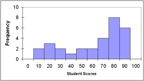
A drawback to the use of a histogram is the lack of actual student data. In illustration 6, it is impossible to determine if or how many students scored a 93. The best interpretation of the data indicates that six students scored in the 90+ range, but no explanation more specific than that can be offered. As you can see, the results displayed by a histogram are not as specific as the data displayed on a frequency distribution data table.
A “double” or “triple barreled” histogram is designed to show trends in similar data. Much like placing multiple frequency distributions on the same data table, a histogram can be expanded to include multiple measures as well. When adding multiple data sets to the same histogram, each data set should be coded to distinguish it from the others. In most cases, the bars are either shaded or colored so that related data appears the same. Thus, the results of exam 1 would appear in a different color than the results of exam 2.
The use of simple histograms evolved into one of the most widely-used concepts in educational statistics which we will talk about next: the bell-shaped or normal curve.
Over many centuries of data collection and analysis, an overwhelming number of frequency distributions and histograms describing real data have repeatedly demonstrated the same relative shape. This particular shape on a histogram has a central highpoint with downward sloping sides in both directions. Both slopes are mirror images of each other. The graphing of real data or a “normal” distribution of data consistently produced this characteristic bell-shaped curve. A mathematical model was then created to describe the graphing of a normal distribution based on this repeated phenomenon. The resulting bell-shaped graph was called a normal curve. Over time, educational statistics have formalized the use of the normal curve as a standard to describe many features about reported results which are useful to teachers.
Illustration 7 is a representation of the normal curve. The normal curve is a fundamental model that is repeatedly referenced in more advanced statistics. The mean, median, and mode of the curve is indicated below and we will talk about these measures in the next lesson.
Illustration 7: Normal Curve
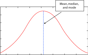
Interpreting a graph of a normal curve is easy. The graph would show that some students did quite well. Their scores would be plotted on the far right side of the graph where the slope nears the X-axis. The majority of the students would score in the middle range. Their scores would create the middle area including the large peak in the center of the graph. Likewise, a few students would not score well on the test. The actual number would be identical to the number of students who scored well on that same exam. The scores of the low performing students would be plotted on the far left and would be a mirror-image opposite of the students who scored well on the test.
Should a teacher expect the results of every exam to reflect the normal curve when graphed? The normal curve is based on a large population and assumes a normal distribution of data, so the answer is “no.”
What types of things might alter the data so that something other than a normal curve is produced? Actually there are a number of things that influence the data. First, the population might not be “normal.” For example, students in the fourth year of a foreign language course do not represent a normal foreign language population. Students at that level are somewhat homogeneous since their effort and dedication set them apart from other students with less experience in that subject area. As a result, we would expect their scores to be very high when measured against other students on the same foreign language test. Therefore, their results should be clustered to the far right of a graph. This cluster of grades on the far right of the graph would not create a normal curve.
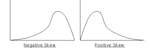
Data is considered skewed if it does not form a normal curve when graphed. A distribution of data can be positively or negatively skewed. For instance, if the speed of the runners in a 100 meter dash was graphed, those students who had special talent or training would score better than those who have neither. Therefore, members of the track team if measured against themselves would typically score in a narrow range at the top of the scale. As another example, what if a teacher did an exceptionally good job in teaching a concept? If those students were measured, it is expected that most of their scores would fall on the far right.
In both of these examples, the data would favor the right side of the graph, which is referred to as negatively skewed. Whenever the data contains an abnormal number of data points on the right side of the graph, the graph is not a normal curve. This means that the population measured did not represent a normal distribution.
It is a time for celebration when a teacher finds that all the students’ scores are negatively skewed on a normal distribution that includes all students in a given population. That means the students performed better than the average on that assessment. Administrators are also made happy when scores for students in their school are negatively skewed when compared to students’ scores from other schools.
As you have probably already guessed, a positively skewed graph is the exact opposite of a negatively skewed graph. A positively skewed graph displays data that is graphed predominantly to the left of the midpoint. This indicates that the greatest number of items plotted were to the left of the center of a normal curve. For instance, if most of the students scored poorly on an assessment, the bulk of the students’ scores would be plotted on the left side of the graph, indicating a positively skewed distribution of data.
Illustration 8: Negative Skew Compared to Positive Skew
Remember that a normal curve only represents a normal distribution of data, so do not worry if the student scores from your midterm exam do not fit into a normal curve.
An understanding of the normal curve serves as a reference point for additional work with educationally significant statistics. In the next lesson, we will use our knowledge of the normal curve to explore ways that we can measure how values in a data sample are both similar and different.