 username@email.com
In this workshop, you will develop the ability to identify the educational significance of statistics and to interpret and apply useful statistics for the classroom. The accompanying video will review statistical concepts and calculations.
This lesson will introduce correlations which help teachers to gain information about the relationships between different classroom data. Specifically, we will review:
A correlation is the measure of a relationship between two or more variables. A correlation is simply a co-relation which defines how well two separate variables “go together.” For a teacher, the two variables might be items such as correlating a successful homework assignment for students to their grades on a related assessment. Correlations also hold the distinction of being the statistic that is most likely to be misunderstood and misused in education.
It is possible to correlate any item to any other item. Some correlations are silly, such as the correlation made between the relative abundance of clouds in the sky to a winning lottery ticket. Other correlations have real value to a teacher, such as the correlation between the amount of time that students study and student achievement. Sometimes correlations are useful, sometimes they are not; sometimes they are positive, sometimes they are negative.
A positive correlation between two events means that when the value of one item increases, then the value of the other item is likely to increase. An example of a positive correlation is the relationship between height and weight: taller people generally weigh more than shorter people. However, since there are plenty of “short” people who weigh as much or more than “tall” people, the correlation cannot be described as strong. A strong positive correlation means that when the value of one item increases, the value of the other item also increases. An example of a strong positive correlation is the relationship between an increase in wealth and an increase in spending. In America, the more people make, the more they spend.
A negative correlation describes an inverse relationship. In this case, when one event increases, the other decreases. For example, before the advent of safety devices in cars, a negative correlation existed between increasing car speed and the number of days without car accidents. In this case, the faster the cars were able to travel, the less the chance of an accident-free day.
For educational purposes, a correlation may be quite useful. For instance, it may be helpful for the teacher to know that a score greater than 75% on a student’s review packet has a strong positive correlation to student performance on the subsequent exam. The teacher would then know to suggest that the students take the review packet seriously and complete it thoughtfully. It may also work in reverse. Some things do not correlate well together. For instance, a teacher may find that completing a particular activity in class had no effect on student performance. Or, a teacher may identify a negative correlation, such as the more time that recess cuts into the spelling instruction period, the lower students’ spelling scores begin to fall.
Correlations are often used to predict events. One of the most common predictions from a strong positive correlation is high school class rank and success in college. That is one of the reasons why post-high school institutions are so interested in high school class rank before admitting incoming freshmen. It is important to know that correlations are often helpful in predicting events. Yet, it is also important to know that a correlation does not imply cause and effect. Thus, a strong positive correlation does not mean that one event causes the next event. This is probably the biggest error that educators make.
For example, there is a strong correlation between people wearing warm coats and cold weather. This does not imply or suggest that people wearing winter coats causes cold weather. The correlation simply means that when there is cold weather, people are more likely to wear winter coats, or, people are more likely to wear winter coats when the weather is cold. There also tends to be a strong correlation between students who play instruments and their high academic achievement in other subject areas. Does this mean that playing in the band causes high academic achievement? No, it means that some of the students who do well in school also play in the band, or students who play in the band are also doing well in school. This correlation does not preclude other students from doing well academically and not playing in the band. One event does not cause the other any more than wearing winter coats causes cold weather.
Wouldn’t it be nice to have a method of correlating important educational events so that decisions could be made with a degree of certainty? Fortunately, there is a mathematical procedure for just this type of situation. It is called the Pearson product-moment correlation coefficient.
The Pearson product-moment correlation coefficient is a simple statistic that indicates the degree of linear relationship between two variables. The Pearson correlation coefficient can range in value from +1.0 to -1.0. A value of +1.0 indicates a perfect direct linear relationship; a value of -1.0 indicates a perfect inverse relationship. For instance, a coefficient of +1.0 means that when the value of something increases, the value of the other item increases. A coefficient of -1.0 means that when something trends upward; the other event is likely to trend downward. For most educational decisions, it isn’t quite that easy. Most coefficients are very seldom +1.0 or -1.0.
A strong coefficient is still helpful, regardless of whether it is positive or negative. For instance, grade point average (GPA) has a strong positive coefficient with scores on the Scholastic Aptitude Test (SAT). For that reason, students are encouraged to do well in school as a preparation for scoring well on the SAT. Likewise, off-task behaviors in students and student achievement have a strong negative coefficient. That is why teachers construct lessons to keep the students meaningfully and thoughtfully engaged in their learning. The level of student achievement and the size of students’ feet have neither a positive nor a negative coefficient. In fact, it would be near zero. This means that there is no predictive relationship that can be established between foot size and student achievement.
The Pearson coefficient provides statistical insight which allows educators to make better decisions regarding what is best for students.
A scatter plot is a graph that shows to what degree two variables correlate. In other words, a scatter plot is a graph of a correlation. In a scatter plot, one of the variables is plotted on the X-axis and the other variable is plotted on the Y-axis. Each individual score or measurement of the two variables is plotted as a single point. The single point is the junction where the two variables meet. It is directly above the score represented by the horizontal axis and to the right of the score on the vertical axis.
The location of the plotted scores indicates the nature of the correlation:
The value of a scatter plot is that the correlation is easily identified by the shape created by the plotted points. Illustration 22 represents a positive correlation graphed as a scatter plot of IQ and achievement in school for a particular 4th grade class.
Illustration 22: Scatter Plot Example
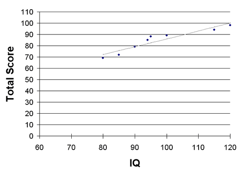
In this particular case, the scores tend to fall in a line extending from the lower left to the upper right as noted by the gray line. Translated, this means that as the students’ IQ increased in that particular 4th grade class, their achievement also increased.
Scatter plots also indicate the degree of strength of a correlation by how close the numbers fall in line. As the plotted points come closer to falling in a perfectly straight line, they also come closer to a perfect +1.0 or -1.0 Pearson coefficient and have greater predictive value. Examine the sequence of scatterplots listed in illustration 23 and note how the points begin to fall into a straight line as the Pearson coefficient increases or decreases toward a +1.0 or -1.0.
Illustration 23: Sequence of Scatter Plots
| Pearson correlation coefficient = -1 |
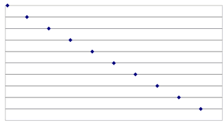 |
| Pearson correlation coefficient ≈ -0.6 |
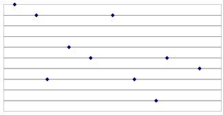 |
| Pearson correlation coefficient ≈ 0 |
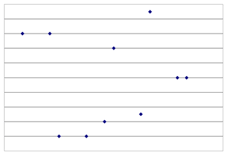 |
| Pearson correlation coefficient ≈ +0.6 |
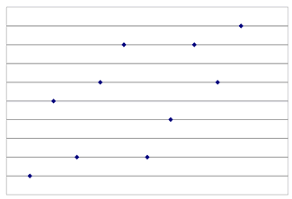 |
| Pearson correlation coefficient = +1 |
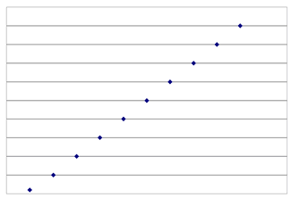 |
Statistical analysis of data is an important aspect of teaching. Whether the analysis is based on the review of students’ scores or a critique of the latest educational research study, the ability to correctly use and understand statistics is vital. Teachers who have mastered the fundamentals described in this chapter will be well ahead of those teachers who are still confused by them.
Test your mastery of this workshop by taking the Statistics Workshop Quiz.
The following is a list of resources that relate to the topic of statistics.
More resources are available on the PTK Recommended Resource list for Assessment.